7 Lab 7: Data summarizing
7.1 Student Learning Outcomes
By the end of this lab, you will be able to:
- Calculate group-wise summary statistics (mean, standard deviation, sample size, and confidence intervals) for a continuous variable across levels of a categorical variable.
- Use faceted histograms to compare the distribution of a continuous variable across groups.
- Create strip plots overlaid with violin plots, group means, and confidence intervals using
ggplot2. - Select and interpret appropriate visualizations to explore the relationship between a categorical variable and a continuous variable.
- Communicate data patterns using well-labeled and appropriately styled visualizations.
7.2 Introduction
When exploring a dataset, one of the most common tasks is comparing a continuous variable across the levels of a categorical variable. For example, does body mass differ between penguin species? Does diamond price vary by cut? Before running statistical models or formal tests, it’s important to visualize these relationships so you can understand the structure of your data, spot potential outliers, and assess whether assumptions for analysis might be met.
In this lab, you’ll focus on two powerful tools for visualizing how a continuous variable varies across categories: faceted histograms and strip plots with overlaid summaries.
A faceted histogram is a good first step when you want to compare the overall shape of a continuous variable across groups. Rather than layering multiple distributions on a single plot (which often leads to visual clutter), faceting creates side-by-side histograms—one for each group—so that you can clearly see differences in spread, skew, and modality. This is especially useful early in the data exploration process when you’re trying to build an intuitive understanding of how your variable behaves across groups.
Once you’ve examined the distributions, a strip plot offers a cleaner and more precise way to compare values between groups. Like a boxplot, it summarizes the distribution of a variable—but unlike a boxplot, a strip plot shows the actual raw data points, which gives you a better sense of sample size, spread, and unusual values. In this lab, you’ll enhance strip plots by adding violin plots (to show the shape of the distribution), the group mean (rather than the median), and 95% confidence intervals for each mean. This approach emphasizes estimation and visualization of group differences using interpretable summaries.
To construct these summaries, you will calculate the following statistics for each group:
The mean of the continuous variable:
\[ \bar{Y} = \frac{1}{n} \sum_{i=1}^{n} Y_i \]The standard deviation:
\[ s = \sqrt{\frac{1}{n - 1} \sum_{i=1}^{n} (Y_i - \bar{Y})^2} \]-
The 95% confidence interval for the mean:
\[ \bar{Y} - t_{\alpha/2,\,df} \cdot SE_{\bar{Y}} < \mu < \bar{Y} + t_{\alpha/2,\,df} \cdot SE_{\bar{Y}} \]
where:- \(\bar{Y}\) is the sample mean
- \(SE_{\bar{Y}} = \dfrac{s}{\sqrt{n}}\) is the standard error of the mean
- \(t_{0.025,\,df}\) is the critical value from the t-distribution with \(df = n - 1\) degrees of freedom
-
The 95% confidence interval for the standard deviation:
\[ \sqrt{\frac{(n - 1) s^2}{\chi^2_{1 - \alpha/2}}} < \sigma < \sqrt{\frac{(n - 1) s^2}{\chi^2_{\alpha/2}}} \]
where:- \(s\) is the sample standard deviation
- \(n\) is the sample size
- \(\chi^2_{\alpha/2}\) and \(\chi^2_{1 - \alpha/2}\) are critical values from the chi-square distribution with \(n - 1\) degrees of freedom
This interval tells you the range of plausible values for the population standard deviation, based on your sample. Though less commonly visualized, it helps assess uncertainty in variability across groups.
In this lab assignment, you’ll first work see a fully developed example using the diamonds dataset to see how to create group summaries and effective visualizations. Then you’ll apply the same techniques to the penguins dataset, answering questions and generating your own analysis using the skills you’ve learned. ## Packages
In this lab you will use functions and datasets from the dplyr and ggplot2 packages. While you could load those packages individually, in this course you are encouraged to always load the entire tidyverse set of packages. In addition, you will be using the Palmer penguins dataset from the palmerpenguins package.
7.3 Instructions
- Claim your personal lab 7 repository on GitHub by following the link on D2L in the corresponding Content module.
- Clone your repository to your computer using the New Project > Version Control > Git method
- Set your Global Options in RStudio
- Open RStudio
- Go to the Tools menu > Global Options
- Under General > Basic, uncheck the boxes under Workspace and History
- Under Code > Editing, check the box for “Use native pipe operator”
- Under Code > Completion, check the box for “Use tab for multiline autocompletions”
- Make your first commit by adding the R project file (lab-7-data-summarizing-your-name.RProj) and gitignore file (.gitignore) to Git.
- The commit message should be “Add RProj and gitignore files”.
- Create a new R script. This is where you will write the code to answer the questions below. Make your second commit by adding the script. The commit message should be “Add R script for assignment”.
- Add code sections to your script by using the Ctrl+Shift+R shortcut, or type them manually in your script using the format
# Heading ----. Under each section, put placeholder comments in the format# Question 1for the questions you will answer below. Sections and questions are as follows:- Load packages
- Summarize data
- Faceted histograms
- Strip plot
- Under the section
# Load packages ----- Write the code to load your packages, i.e.
library(package_name) - You will be using the tidyverse and palmerpenguins packages in this assignment
- Best practice: put the library commands in your script, click save, and click the Install button that appears on the banner at the top of your source pane (your R script).
- Alternative method: use the Packages tab in RStudio (lower right pane) to check for the presence of the two packages, and to install them if necessary.
- Not recommended: typing
install.packages()into the console - Definitely not recommended: putting
install.packages()in your R script.
- Write the code to load your packages, i.e.
- Add placeholder comments for each question you will answer:
- Under the summarize data section, put comments for questions 1–4, for example:
# Question 1 - Under the faceted histogram section, put a comment for questions 5
- Under the strip plot section, put a comment for question six.
- Under the summarize data section, put comments for questions 1–4, for example:
- Save your script, commit it to Git, and push the commit to GitHub. A good commit message would be “Add code sections and question placeholders”.
- Write code the answer the questions listed below.
- Below the comment for each question, write code to perform the requested action
- For each question, only include the minimum code necessary. Do not include every version of code you tried.
- Do not assign the results a name (i.e. do not create an object) using the assignment operator
->unless it is necessary to complete a subsequent task. For example, when you create a summary table and then need to plot both the raw and summarized data on the same graph.
- To submit your assignment:
- In a web browser, navigate to your Git repository, copy the URL
- Paste that as your assignment in the D2L submission box for the lab
7.4 Questions
All questions work with the penguins dataset. The first question introduces you to the idea of summarizing by group. The second question shows you how to calculate sample size. The third question illustrates the estimation of a confidence interval for a mean, and the fourth question adds a confidence interval for the standard deviation. The final two questions show you how to visualize the distribution of values for each sample and add summary statistics to those visualizations.
- Estimate the mean bill depth of penguins by species (one mean per species)
- Start with the
penguinsdata frame - Pipe the data frame into the next function using the native pipe operator
|> - Group by species using the
group_by()function described in R4DS 3.4.1group_by()- The argument to
group_by()is the unquoted name of the variable (column) that contains the categorical variable you want to use to separate your observations (rows) into groups - Hint: the instructions say “by species”
- The argument to
- Use the
summarize()function described in R4DS 3.5.2summarize().- The argument for the function is a name = value pair where name is the new name of the summary statistic you want to create, and value is the value, function, or equation used to calculate the summary statistic.
- What should you name your summary statistic? Because it is the mean of bill depth, you could use mean_bd.
- Which equation should use you to calculate the summary statistic? Common summary functions include
mean(),median(), andsd(). - For example, to create a summary statistic for median flipper length, you would use:
median_fl = median(flipper_length_mm)
- Run your code now and you may see a value of
NAfor the mean for certain groups. This is because there are missing values in the data for those groups. You should adjust your code for calculating the sample statistic so that it only uses the non-missing values.- Exclude those missing values during calculation of the mean by setting the
na.rmargument toTRUE. - Extending the example above for calculating a median:
median_fl = median(flipper_length_mm, na.rm = TRUE).
- Exclude those missing values during calculation of the mean by setting the
- Start with the
- For each species, calculate the number of penguins (aka rows, aka observations) in the dataset, and the sample size (the number of values used to calculate the mean).
- Start by copying your code from question 1.
- Add a new summary statistic for the number of rows in the dataset for each species
- You can calculate multiple summary statistics in the same summarize function. To do this, in the summarize function, put a comma after your equation for the mean. On a new line, add your new summary statistic. See the third code block in R4DS 3.5.2
summarize()for an example of calculating two variables,avg_delayandn, in the same summarize function. - Name the new variable n_rows and use the
n()equation to calculate it. This function counts the number of rows in the dataset—for each group, if you are usinggroup_by(). - The function does not take any arguments, for example
n = n().
- You can calculate multiple summary statistics in the same summarize function. To do this, in the summarize function, put a comma after your equation for the mean. On a new line, add your new summary statistic. See the third code block in R4DS 3.5.2
- You might be tempted to think of your new
n_rowsstatistic as the same size for calculating the means. This isn’t always the case, however, asn()counts all the rows in the dataset regardless of whether they contain missing values (NA) for a particular variable of interest. The actual sample size would not count those missing values. So how do we exclude them? See below. - Add a new summary statistic for the number of missing values for bill depth for each species.
- Name the new variable
n_nas(number of NAs). - Use the equation
sum(is.na(bill_length_mm))to calculate the statistic. Why does this work? The functionis.na()returnsTRUEwhen a value isNAandFALSEwhen a value is not. Thesum()function coerces that vector of trues an falses into numerical format by convertingTRUEs to1s andFALSEs to0s. Adding up the1s gives you the number of missing values.
- Name the new variable
- Add a new summary statistic for the number of non-missing values for bill depth for each species. This is the sample size used to calculate the mean.
- Name the new variable
sample_size. - Modify the previous equation so it returns TRUE when a value is not missing and FALSE when it is missing. In R this is done by adding the not operator
!before theis.na(). All TRUE values become !TRUE, i.e. FALSE, and vice versa. - For example:
sum(!is.na(bill_length_mm)).
- Name the new variable
- Note how
nandsampl_sizeare not the same. Ask yourself: which should you use to calculate a standard error of the mean?
- Estimate a 95% confidence interval for the mean bill depth of penguins, by species.
- Start by copying your code from question 2.
- Remove the statistics for
n_rowsandn_nas. - Add a new summary statistic for the standard deviation of bill depth.
- Add a new summary statistic for the standard error of the mean.
- Name the new variable std_err_mean
- See the Introduction for a reminder of how to calculate the standard error: \(SE_{\bar{Y}} = \frac{s}{\sqrt{n}}\) where \(s\) is the sample standard deviation and \(n\) is the sample size.
- In a
summarize()function, you can use variables you have just calculated in subsequent variables. Here you will use thesample_sizeandstd_devvariables you have already calculated to calculate the newstd_err_meanvariable. - Use the
sqrt()function to calculate the square root, and the/operator to divide. - For example:
std_err_mean = sample_size / sqrt(std_err)
- Add a new variable to hold the critical value from the \(t\) distribution we will use to calculate the confidence interval.
- Name the new variable t_crit (t critical value)
- Use the
qt()function to calculate the t-value needed for the confidence interval- This function takes two main arguments:
panddf. -
pis the cumulative probability, meaning the area under the t-distribution curve to the left of the desired t-value.- For a two-tailed 95% confidence interval, use
p = 0.975(because 2.5% is in the upper tail).
- For a two-tailed 95% confidence interval, use
- df is the degrees of freedom and is typically calculated as the sample size minus one:
df = sampl_size - 1 - example:
qt(p = 0.975, df = sampl_size - 1)
- This function takes two main arguments:
- Technically this is not a summary statistic as it does not summarize data values into a single statistic. When you run your code, this will be apparent because each row will contain the same value.
- Add two new values for the upper and and lower bounds to the confidence interval.
- Name these two variables ci_mean_upper and ci_mean_lower.
- See the Introduction for a reminder of how to calculate a confidence interval for the mean: \(\bar{Y} - t_{\alpha/2,\,df} \cdot SE_{\bar{Y}} < \mu < \bar{Y} + t_{\alpha/2,\,df} \cdot SE_{\bar{Y}}\).
- Use the
t_critandstd_err_meanvariables you just created to calculate the confidence intervals - For example:
ci_mean_upper = t_crit * std_err_mean.
- Estimate the standard deviation of body mass by species. Include a 95% confidence interval for the standard deviation.
- Calculate the sample size and estimate the sample standard deviation as above.
- See the Introduction for a reminder of how to calculate a confidence interval for the standard deviation: \(\sqrt{\frac{(n - 1) s^2}{\chi^2_{1 - \alpha/2}}} < \sigma < \sqrt{\frac{(n - 1) s^2}{\chi^2_{\alpha/2}}}\) where \(\sigma\) is the population standard deviation, \(s\) is the sample standard deviation, \(n\) is the sample size, and \(\chi^2_{1 - \alpha/2}\) and \(\chi^2_{\alpha/2}\) are the critical values from the chi-squared distribution.
- Before you can calculate the confidence interval, you must look up the two chi-squared critical values.
- Add two new variables, chi2_lower and chi2upper, to hold the critical values.
- Calculate these values using the following equations:
chi2_lower = qchisq(0.975, df = sample_size - 1)chi2_upper = qchisq(0.025, df = sample_size - 1)- Note the different values for the
pargument
- Side note: there are two critical values here because the chi-squared distribution is not symmetrical like the t distribution.
- Add two new variables for the upper and lower bounds for the confidence interval around your estimate of the sample standard deviation
- Name the new variables ci_std_dev_upper (upper bound to the confidence interval) and ci_std_dev_lower (lower bound to the confidence interval)
- See if you can write the equations to calculate the bounds yourself. If you need help, refer to the worked example below.
- Create a single graph that shows the distribution of penguin body masses using three histograms, one for each species; include vertical lines showing the median and mean body masses for each species
- Before plotting, you need to prepare the medians and means for adding to the histograms. To add both statistics to the same graph and label them appropriately, you need to reshape the summary data into long format using
pivot_longer()and save this new, reshaped data frame for later use by assigning it a name with the->assignment operator. Here are steps to create the reshaped summary data frame:- Assigning the new name, for example:
penguin_lines -> - Start with the peguins dataset:
penguins |> - Summarize the dataset by calculating the mean and median body mass.
- For example, name your new variables median_bm, and mean_bm.
- Use
pivot_longer()to put the name of the statistic, “Mean” or “Median”, in a new column named statistic, and the values in a new column named value. See the example below. - Recode the statistic variable so it has pretty names that will look good on the graph.
- For example, recode “mean_bd” as “Mean”
- Assigning the new name, for example:
- Create your ggplot, using the raw penguins data.
- geom_histogram() creates the histogram
- Choose an appropriate number of bins using the
bins=argument.
- Choose an appropriate number of bins using the
- Add a
geom_vline()and set the data argument to the vertical line dataset you just created, penguin_lines - Be sure to add the
x=grouping_variableto the aesthetic for the vline. Because you are using a different dataset for this geom, it will not inherit the x aesthetic from the ggplot call. - facet_wrap() separates the three species into different panels
- The argument to facet wrap should be an equation (use the tilde
~) with the name of the grouping variable - Add the
ncol=1argument to force the histogram panels to be in a single column rather than the default side-by-side. - Example: to facet the diamonds data by cut, use
facet_wrap(~ cut, ncol = 1)
- The argument to facet wrap should be an equation (use the tilde
- geom_histogram() creates the histogram
- Before plotting, you need to prepare the medians and means for adding to the histograms. To add both statistics to the same graph and label them appropriately, you need to reshape the summary data into long format using
- Create a strip plot that shows the distribution of penguin body masses by species
- Include the raw data (geom_point)
- Include violin plots (geom_violin)
- Include the means (geom_point)
- Include the confidence intervals for the mean (geom_errorbar)
7.5 Example
This example shows how to explore the relationship between diamond price and cut using the diamonds dataset from the ggplot2 package. The variable cut is a categorical variable describing the quality of the diamond’s cut, ranging from Fair to Ideal. Because cut influences how well a diamond reflects light, we might expect it to be associated with differences in price.
We’ll walk through loading packages, summarizing price by cut, and creating two types of plots: faceted histograms to show the distribution of prices by cut, and strip plots with overlaid violin plots, means, and confidence intervals.
7.5.2 Summarizing the data
# summarize price by cut ---------------------

diamond_summary <-
  diamonds %>%
  group_by(cut) %>%
  summarize(
    median_price = median(price, na.rm = TRUE),
    mean_price = mean(price, na.rm = TRUE),
    std_dev_price = sd(price, na.rm = TRUE),
    sample_size = sum(!is.na(price)),
    std_err_mean = std_dev_price / sqrt(sample_size),
    t_crit = qt(0.975, df = sample_size - 1),
    ci_mean_lower = mean_price - t_crit * std_err_mean,
    ci_mean_upper = mean_price + t_crit * std_err_mean,
    chi2_lower = qchisq(0.975, df = sample_size - 1),
    chi2_upper = qchisq(0.025, df = sample_size - 1),
    ci_sd_lower = sqrt((sample_size - 1) * std_dev_price^2 / chi2_lower),
    ci_sd_upper = sqrt((sample_size - 1) * std_dev_price^2 / chi2_upper)
  ) |>
  print()
#> # A tibble: 5 × 13
#> cut median_price mean_price std_dev_price sample_size std_err_mean t_crit
#> <ord> <dbl> <dbl> <dbl> <int> <dbl> <dbl>
#> 1 Fair 3282 4359. 3560. 1610 88.7 1.96
#> 2 Good 3050. 3929. 3682. 4906 52.6 1.96
#> 3 Very Go… 2648 3982. 3936. 12082 35.8 1.96
#> 4 Premium 3185 4584. 4349. 13791 37.0 1.96
#> 5 Ideal 1810 3458. 3808. 21551 25.9 1.96
#> # ℹ 6 more variables: ci_mean_lower <dbl>, ci_mean_upper <dbl>,
#> # chi2_lower <dbl>, chi2_upper <dbl>, ci_sd_lower <dbl>, ci_sd_upper <dbl>7.5.3 Facetted histograms
# Faceted histograms ------------------------

# Prepare a long-format data frame for
#   vertical lines
diamond_lines <-
  diamond_summary |>
  select(cut, mean_price, median_price) |>
  pivot_longer(
    cols = c(mean_price, median_price),
    names_to = "statistic",
    values_to = "value"
  ) |>
  mutate(
    # make the statistic names readable
    statistic = recode(
      statistic,
      median_price = "Median",
      mean_price = "Mean",
    ),
    # ensure order in legend
    statistic = factor(
      statistic,
      levels = c("Median", "Mean")
    )
  ) |>
  print()
#> # A tibble: 10 × 3
#> cut statistic value
#> <ord> <fct> <dbl>
#> 1 Fair Mean 4359.
#> 2 Fair Median 3282
#> 3 Good Mean 3929.
#> 4 Good Median 3050.
#> 5 Very Good Mean 3982.
#> 6 Very Good Median 2648
#> # ℹ 4 more rows
# Create the plot
ggplot(diamonds, aes(x = price)) +
  geom_histogram(bins = 30, fill = "gray70", color = "black") +
  geom_vline(
    data = diamond_lines,
    aes(xintercept = value, linetype = statistic),
    color = "red",
    show.legend = TRUE
  ) +
  facet_wrap(~ cut, scales = "free_y", ncol = 1) +
  labs(
    title = "Distribution of Diamond Prices by Cut",
    x = "Price (USD)",
    y = "Frequency",
    linetype = "Statistic"
  ) +
  theme_minimal() +
  theme(legend.position = "bottom")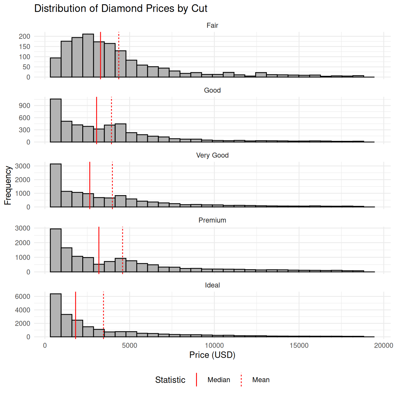
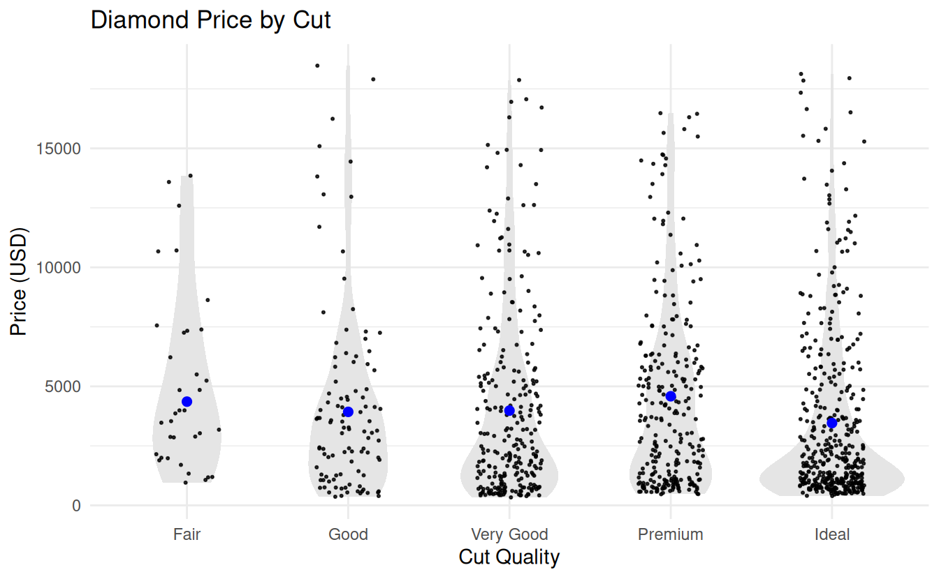
7.5.4 Strip plots
# Strip plot with violin and means ----------
diamonds |>
  sample_frac(.02) |> # only for big data sets
  ggplot(aes(x = cut, y = price)) +
  geom_violin(fill = "gray90", color = NA) +
  geom_jitter(
    width = 0.2, alpha = 0.8, size = 0.4
  ) +
  geom_linerange(
    data = diamond_summary,
    aes(x = cut, y = NULL,
        ymin = ci_mean_lower,
        ymax = ci_mean_upper),
    color = "blue",
    linewidth = 0.8
  ) +
  geom_point(
    data = diamond_summary,
    aes(x = cut, y = mean_price),
    color = "blue",
    size = 2
  ) +
  labs(
    title = "Diamond Price by Cut",
    x = "Cut Quality",
    y = "Price (USD)"
  ) +
  theme_minimal()