6 Lab 6: Data summarizing
6.1 Objectives
In this lab, you will learn to:
Rename variables
Create new variables
Summarize a dataset as a whole or by groups
-
Visualize the relationship between variables
- One numerical and one categorical variable
- Two numerical variables
- Three variables
6.2 Introduction
Visualizing data is a key step in the data science workflow, but it is rarely the first step. Sometimes you only need part of a dataset to answer your question, which is why the previous lab, Data subsetting, introduced you to methods for extracting a subset of observations or variables from a table. At other times, you may need to create new variables from the original ones, or you may need to calculate summary statistic for a dataset or for groups within a dataset. This lab will introduce you to methods for that using the diamonds dataset from the ggplot2 package and new functions from the dplyr package.
In this lab you will:
- Rename variables with
rename() - Create new variables with mutate
mutate() - Summarize a dataset with
group_by()andsummarize()
6.2.1 Packages
In this lab you will use functions and datasets from the dplyr and ggplot2 packages. While you could load those packages individually, in this course you are encouraged to always load the entire tidyverse set of packages.
Load the tidyverse package:
#> ── Attaching core tidyverse packages ──────────────────────── tidyverse 2.0.0 ──
#> ✔ dplyr     1.1.4     ✔ readr     2.1.5
#> ✔ forcats   1.0.0     ✔ stringr   1.5.1
#> ✔ ggplot2   3.5.1     ✔ tibble    3.2.1
#> ✔ lubridate 1.9.4     ✔ tidyr     1.3.1
#> ✔ purrr     1.0.4
#> ── Conflicts ────────────────────────────────────────── tidyverse_conflicts() ──
#> ✖ dplyr::filter() masks stats::filter()
#> ✖ dplyr::lag()    masks stats::lag()
#> ℹ Use the conflicted package (<http://conflicted.r-lib.org/>) to force all conflicts to become errors
6.2.2 diamonds data
In addition to getting us access to dplyr packages, loading the tidyverse package also lets us access the diamonds dataset from the ggplot2 package. This lab will use the diamonds dataset to show examples of renaming, mutating, summarizing, and graphing.
You can read more about the diamonds dataset in the previous lab, Data subsetting.
6.3 Rename variables with rename()
The rename() function allows you to rename variables in a data frame. The first argument to rename() is the data frame. The other arguments specify which variables to rename, with the format new_name = old_name.
For example, say you want to rename the x, y, and z variables to length, width, and height:
rename(diamonds, length = x, width = y, height = z)#> # A tibble: 53,940 × 10
#> carat cut color clarity depth table price length width height
#> <dbl> <ord> <ord> <ord> <dbl> <dbl> <int> <dbl> <dbl> <dbl>
#> 1 0.23 Ideal E SI2 61.5 55 326 3.95 3.98 2.43
#> 2 0.21 Premium E SI1 59.8 61 326 3.89 3.84 2.31
#> 3 0.23 Good E VS1 56.9 65 327 4.05 4.07 2.31
#> 4 0.29 Premium I VS2 62.4 58 334 4.2 4.23 2.63
#> 5 0.31 Good J SI2 63.3 58 335 4.34 4.35 2.75
#> 6 0.24 Very Good J VVS2 62.8 57 336 3.94 3.96 2.48
#> # ℹ 53,934 more rowsNote the lack of quotes around the names of the data frame, the new variable names or the old variables names
The more arguments there are to a function, the harder it is to read. If your line of code gets too long, or is hard to read, try putting each argument on its own line like this:
rename(
  diamonds,
  length = x,
  width = y,
  height = z
)
This makes the code more readable. Just be sure you have commas after each argument except the last, and don’t forget the closing parenthesis on its own line
6.4 Create new variables with mutate()
The mutate() function allows you to create a new variable in a data frame. As with other dplyr functions, the first argument to mutate() is the data frame. Additional arguments are name-value pairs. The name gives the name of the column in the output. The value is often a mathematical expression (in the case of numerical variables), a function, or some combination of both.
Let’s do an example using the diamonds dataset. To make viewing the new variables easier, first select a subset of variables from the diamonds data set using select() and give the new data frame the name d2:
# select the variables of interest
d2 <- select(diamonds, carat, price)
d2
#> # A tibble: 53,940 × 2
#> carat price
#> <dbl> <int>
#> 1 0.23 326
#> 2 0.21 326
#> 3 0.23 327
#> 4 0.29 334
#> 5 0.31 335
#> 6 0.24 336
#> # ℹ 53,934 more rowsNow use the new data frame d2 to calculate the price per carat for each diamond. You can call the new variable anything you want. In this example, it is named ppc (“price per carat”):
# example of creating price per carat (ppc)
mutate(d2, ppc = price / carat)
#> # A tibble: 53,940 × 3
#> carat price ppc
#> <dbl> <int> <dbl>
#> 1 0.23 326 1417.
#> 2 0.21 326 1552.
#> 3 0.23 327 1422.
#> 4 0.29 334 1152.
#> 5 0.31 335 1081.
#> 6 0.24 336 1400
#> # ℹ 53,934 more rows
6.4.1 mutate() an existing variable
You do not have to create an entirely new variable when using mutate(). For example, let’s say you wanted to convert the price from US Dollars (USD) to Canadian Dollars (CAD). The current exchange rate is about 1 USD to 1.27 CAD. You can overwrite the existing price variable by setting the new variable name to be the same as the old variable name:
mutate(diamonds, price = price * 1.27)#> # A tibble: 53,940 × 10
#> carat cut color clarity depth table price x y z
#> <dbl> <ord> <ord> <ord> <dbl> <dbl> <dbl> <dbl> <dbl> <dbl>
#> 1 0.23 Ideal E SI2 61.5 55 414. 3.95 3.98 2.43
#> 2 0.21 Premium E SI1 59.8 61 414. 3.89 3.84 2.31
#> 3 0.23 Good E VS1 56.9 65 415. 4.05 4.07 2.31
#> 4 0.29 Premium I VS2 62.4 58 424. 4.2 4.23 2.63
#> 5 0.31 Good J SI2 63.3 58 425. 4.34 4.35 2.75
#> 6 0.24 Very Good J VVS2 62.8 57 427. 3.94 3.96 2.48
#> # ℹ 53,934 more rows
6.5 Summarize a data set with summarize()
You can summarize a data set using the summarize() function. Like other dplyr functions, the first argument to summarize() is the data frame. Additional arguments are name-value pairs, just like with mutate(). Values are set using various summary functions such as mean() or sd() (standard deviation). The difference is that whereas mutate() returns a data frame with the same number of rows as the input data frame, summarize() returns a data frame with only one row, and the only variables in the new data frame are the ones you named in summarize(). For example, to calculate the mean value of the carat variable, the code would look like this:
#> # A tibble: 1 × 1
#>   mean_carat
#>        <dbl>
#> 1      0.798
You can calculate multiple summary statistics at the same time by providing a comma-separated list of name-value pairs. Because the line starts getting long, this example has each argument on its own line, but it would work just fine if everything was on the same line.
6.5.1 Summary functions
There are a wide variety of functions you can use to summarize a variable. Here are some examples:
-
max()- maximum value -
min()- minimum value -
median()- median value -
mode()mode -
sd()standard deviation -
var()variance -
IQR()interquartile range
For each of those functions, you must put the name of the variable you want to summarize inside the given function as the first argument.
6.5.1.1 Sample size
There is also a special summary function n() which returns the number of rows, i.e. the sample size. Here is an example:
#> # A tibble: 1 × 1
#>   sampl_size
#>        <int>
#> 1      53940
6.5.1.2 Quantiles
Some summary functions require one or more arguments in addition to the name of the variable to summarize.
One example is the quantile() function, whose probs argument is the probability you want to calculate the quantile for. For example, to calculate the first quartile (0.25 quantile) of the variable carat, you can use the quantile function with the argument of probs = 0.25:
#> # A tibble: 1 × 1
#>      q1
#>   <dbl>
#> 1   0.4
6.5.2 Combine functions and equations
When summarizing, you can use both functions and mathematical operators when creating a new variable. For example, here is code that calculates the standard error of the mean for the price variable. Remember that standard error is equal to the standard deviation divided by the square root of the sample size:
#> # A tibble: 1 × 1
#>     sem
#>   <dbl>
#> 1  17.2
Notice that the equation for standard error (sem) above uses both the sd() function and the n() function.
Alternative, you could summarize the mean and sample size first and then use those new variables for creating a third variable. In the example below we calculate the mean and sample size first, use those to calculate the standard error, and then use that to calculate an approximate 95% confidence interval:
summarize(
  diamonds,
  mean_p = mean(price),
  sd_p = sd(price),
  sampl_size = n(),
  sem = sd_p / sqrt(sampl_size),
  ci_upper_limit = mean_p + 1.96 * sem,
  ci_lower_limit = mean_p - 1.96 * sem
)
#> # A tibble: 1 × 6
#> mean_p sd_p sampl_size sem ci_upper_limit ci_lower_limit
#> <dbl> <dbl> <int> <dbl> <dbl> <dbl>
#> 1 3933. 3989. 53940 17.2 3966. 3899.6.6 Summarize a data set by groups
In the previous section you learned how to use summarize() combined with a summary functions such as mean() and sd() to calculate statistics for all observations (rows) in a data set.
A common goal in data transformation, however, is to calculate statistics for groups of observations rather than all observations together. For example, in a university course with two sections, you may want to calculate mean scores for each section instead of the class as a whole.
The group_by() function combined with the summarize() function lets you calculated summary statistics for groups of observations. The groups are identified by a categorical variable called the grouping variable, while the statistics are calculated from one or more other variables.
For example, let’s explore how the mean price varies with the cut of a diamond in the diamonds data set.
In the first step, you use group_by() to produced a grouped data frame. Like other dplyr verbs, the first argument to group_by() is the name of the dataset. Additional arguments identify the variables you want to group by. In this example, we group the diamonds dataset by the cut variable and assign the resulting grouped data frame a new name, diamonds_grouped:
diamonds_grouped <- group_by(diamonds, cut)
diamonds_grouped
#> # A tibble: 53,940 × 10
#> # Groups: cut [5]
#> carat cut color clarity depth table price x y z
#> <dbl> <ord> <ord> <ord> <dbl> <dbl> <int> <dbl> <dbl> <dbl>
#> 1 0.23 Ideal E SI2 61.5 55 326 3.95 3.98 2.43
#> 2 0.21 Premium E SI1 59.8 61 326 3.89 3.84 2.31
#> 3 0.23 Good E VS1 56.9 65 327 4.05 4.07 2.31
#> 4 0.29 Premium I VS2 62.4 58 334 4.2 4.23 2.63
#> 5 0.31 Good J SI2 63.3 58 335 4.34 4.35 2.75
#> 6 0.24 Very Good J VVS2 62.8 57 336 3.94 3.96 2.48
#> # ℹ 53,934 more rowsThe only difference in the output from printing the ungrouped diamonds table is the second line of the output, which now says # Groups: cut [5]. That’s saying the table is grouped by the cut variable and there are five groups (the five possible values of cut).
The next step is to summarize the grouped data frame, just like you summarized the ungrouped data frame in the previous section:
#> # A tibble: 5 × 2
#>   cut       mean_price
#>   <ord>          <dbl>
#> 1 Fair           4359.
#> 2 Good           3929.
#> 3 Very Good      3982.
#> 4 Premium        4584.
#> 5 Ideal          3458.
6.7 Quick contingency tables
Counting the number of observations by group is a fairly common task, especially when you are exploring your data interactively in an R session (e.g. by typing commands into the console). One way to do this would be to use a grouped summary and the n() function as described above, for example:
#> # A tibble: 5 × 2
#>   cut           n
#>   <ord>     <int>
#> 1 Fair       1610
#> 2 Good       4906
#> 3 Very Good 12082
#> 4 Premium   13791
#> 5 Ideal     21551
Because it is such a common task, dplyr includes a special function count() to do just that but in fewer commands:
count(diamonds, cut)#> # A tibble: 5 × 2
#> cut n
#> <ord> <int>
#> 1 Fair 1610
#> 2 Good 4906
#> 3 Very Good 12082
#> 4 Premium 13791
#> 5 Ideal 21551You can also do this to create a quick contingency table for multiple variables:
distinct(diamonds, cut, clarity)#> # A tibble: 40 × 2
#> cut clarity
#> <ord> <ord>
#> 1 Ideal SI2
#> 2 Premium SI1
#> 3 Good VS1
#> 4 Premium VS2
#> 5 Good SI2
#> 6 Very Good VVS2
#> # ℹ 34 more rowsIf you just want to see the distinct values (levels) of a categorical variable, or the combinations of values for two or more categorical variables in a dataset, but you don’t need the counts, there is an even simpler function distinct() for that:
distinct(diamonds, cut)#> # A tibble: 5 × 1
#> cut
#> <ord>
#> 1 Ideal
#> 2 Premium
#> 3 Good
#> 4 Very Good
#> 5 FairThe functions count() and distinct() are useful when you want to get a quick handle on your categorical variables.
6.8 Visualize a categorical and numerical variable
In the Introduction to ggplot2 lab, you learned how to create a histogram to visualize the distribution of a single numerical variable. But what if you want to look at how two variables are related? For example, say you want to visualize the relationship between the cut and price of diamonds we summarized in the previous example.
Here you will learn two ways to visualize the joint distribution of a numerical variable and a categorical variable:
- Multiple histograms
- Strip plots
6.8.1 Multiple histograms
A common way of comparing multiple distributions is to create a single graph with multiple histograms, one for each variable or subset of observations.
The facet_wrap() function in ggplot2 allows you to take a plot and split it up into multiple plots based on some categorical variable. The first argument to facet_wrap() is an expression of the form ~ var_name where var_name is the name of the grouping variable.
First, let’s start by graphing the distribution of the price variable without regard to cut. We will set the number of bin width to 500 (dollars)
ggplot(data = diamonds) +
  geom_histogram(mapping = aes(x = price), binwidth = 500)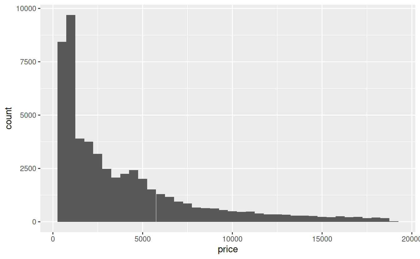
Interestingly, the distribution appears to be bimodal, with the second, smaller mode around 4500.
Now lets plot the same graph but add the facet_wrap() function. Remember to add a plus sign + at the end of the geom_histogram() so R knows you are trying add another layer to the graph:
ggplot(data = diamonds) +
  geom_histogram(mapping = aes(x = price), binwidth = 500) +
  facet_wrap(~ cut)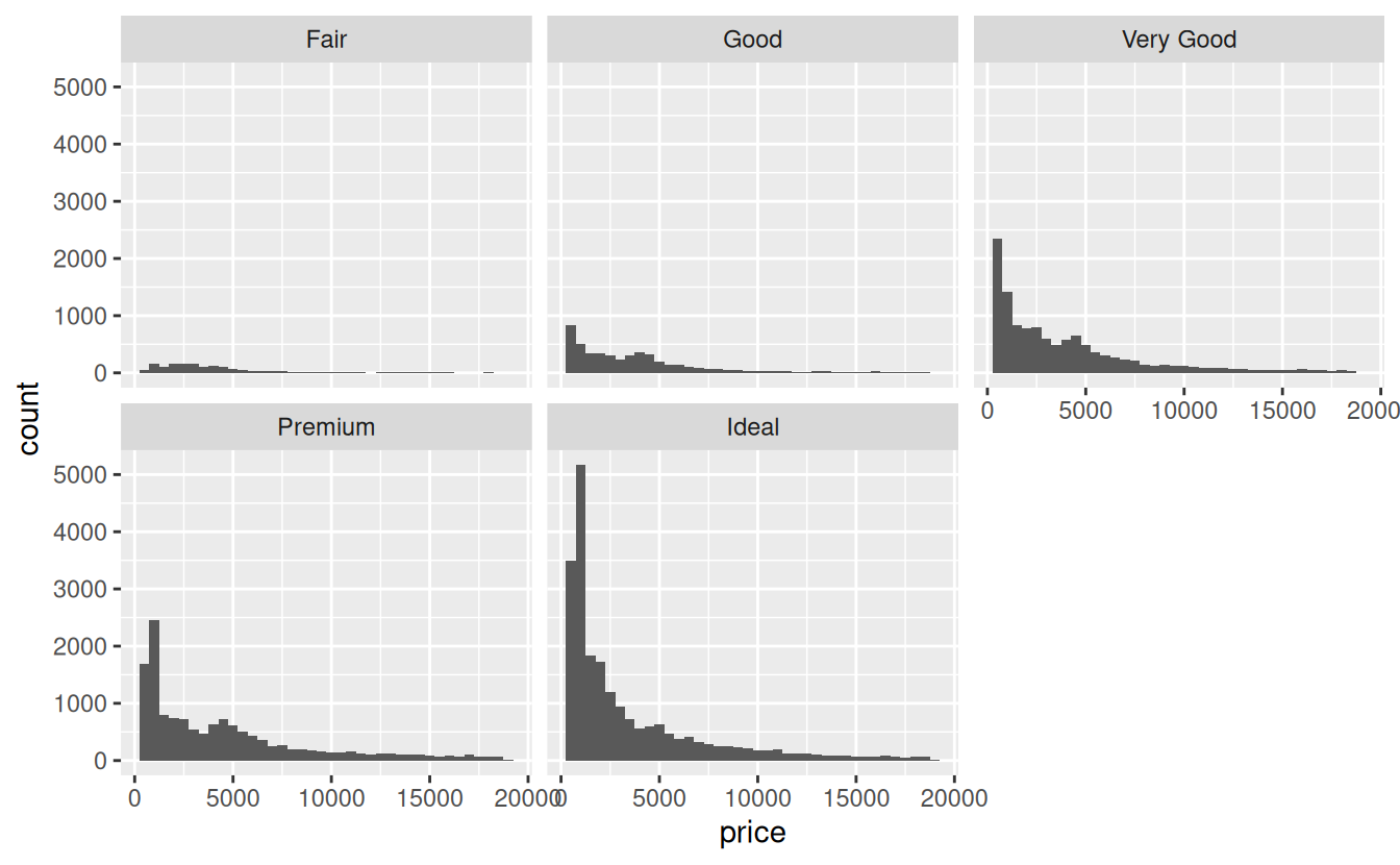
The resulting plot now has five small graphs, called facets in tidyverse lingo, each labeled with the value of cut it represents.
A common issue when faceting is that all facets have the same x and y axis limits. For example, in the graph above, the y axis ranges from 0 to about 5500, but the highest count for Fair cut diamonds is less than 200 because there are far fewer of these diamonds sold. If you goal is to show the distribution of prices rather than the relative sample size of the each cut, it makes more sense to let the y axis scale vary based on the data. You can accomplish this with the scales argument to facet_wrap():
ggplot(data = diamonds) +
  geom_histogram(mapping = aes(x = price), binwidth = 500) +
  facet_wrap(~ cut, scales = "free_y")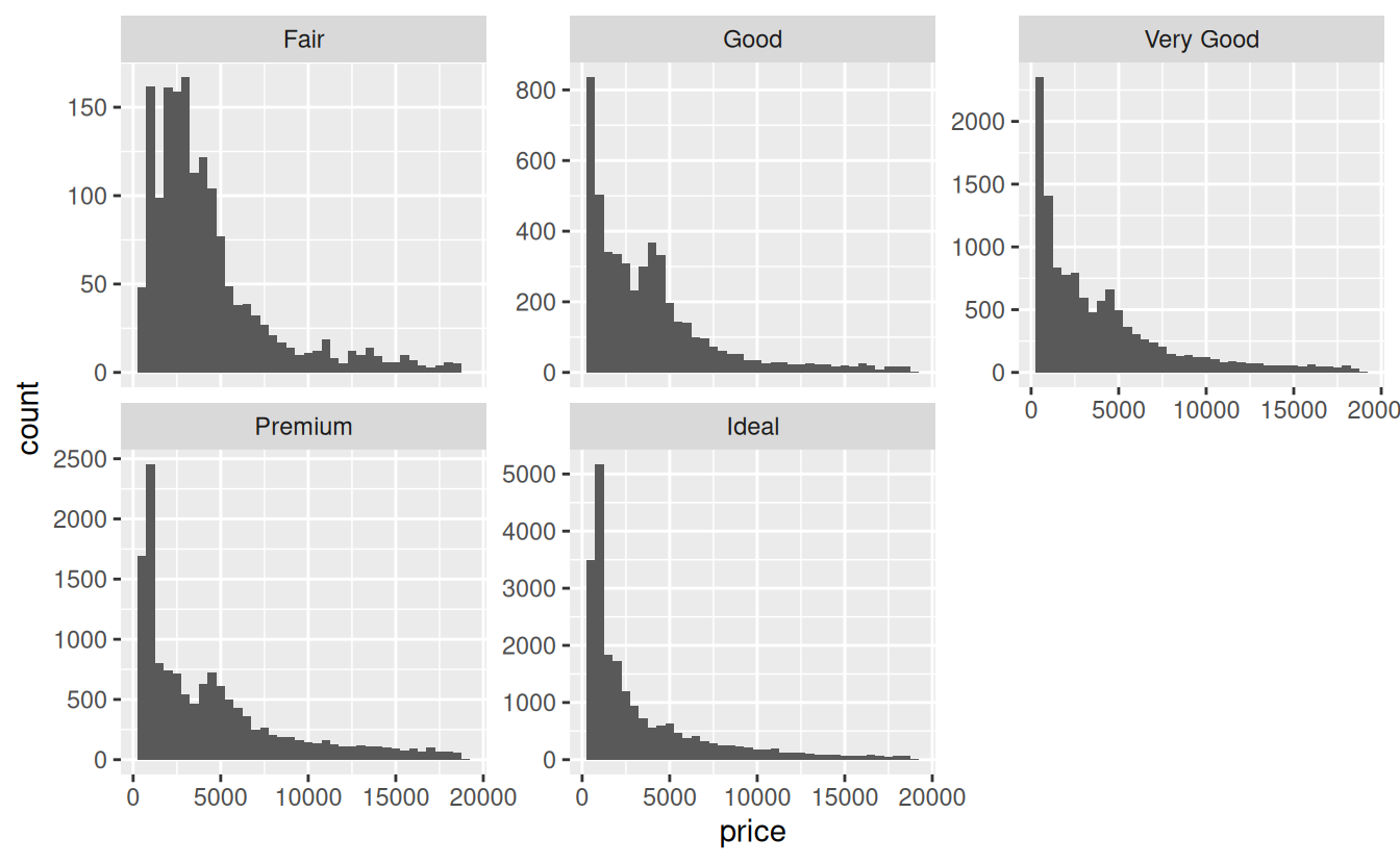
The scales argument can be set to "free_y", "free_x", or "free" to allow both axes to vary.
Other useful arguments to facet_wrap() include nrow and ncol, one of which can be used to specify how many rows or columns the resulting facets should form. With histograms, it’s common to put them all in one column so you can compare the shape of the distributions more easily.
6.8.2 Strip plots
Strip charts are another common way to visualize the relationship between a numerical variable and a categorical variable. For this kind of plot, you use the geom_jitter() function. Unlike a histogram, which creates the y axis for you by counting the number of rows, a strip chart requires you to specify both the x and y axes in the aesthetic mapping. Most often the categorical variable is the explanatory variable and is placed on the x axis:
ggplot(data = diamonds) +
  geom_jitter(mapping = aes(x = cut, y = price))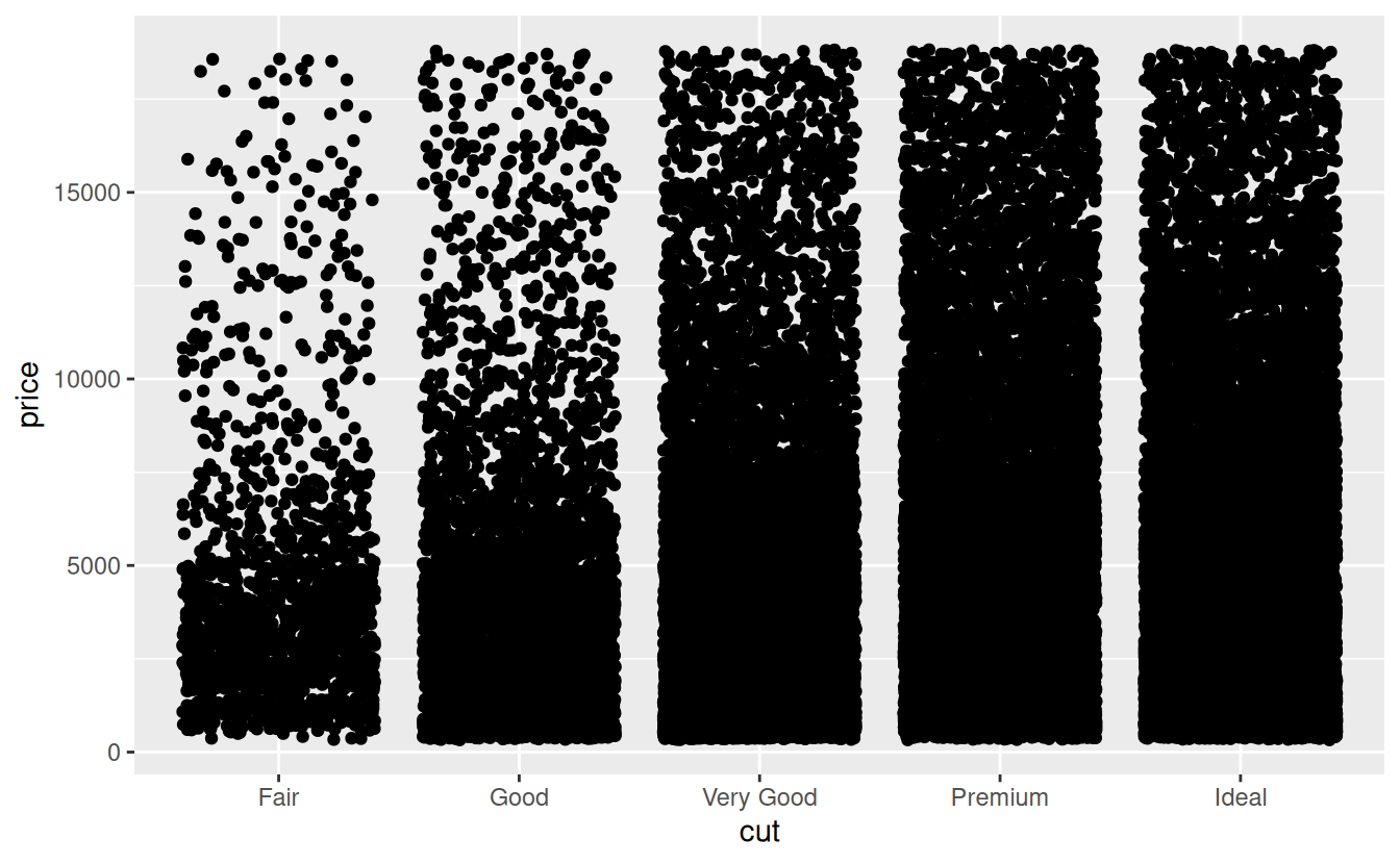
As you can see, there is quite a bit of overplotting. This makes it more difficult to estimate the density of points in any part of the graph. If overplotting is minor, one solution is to use hollow circles instead of filled ones by altering the shape argument to geom_jitter(). With severe overplotting like this, a better strategy is to make the points semi-transparent by setting the alpha argument to something low like 0.1 indicating 10% opacity.
ggplot(data = diamonds) +
  geom_jitter(mapping = aes(x = cut, y = price), alpha = .1)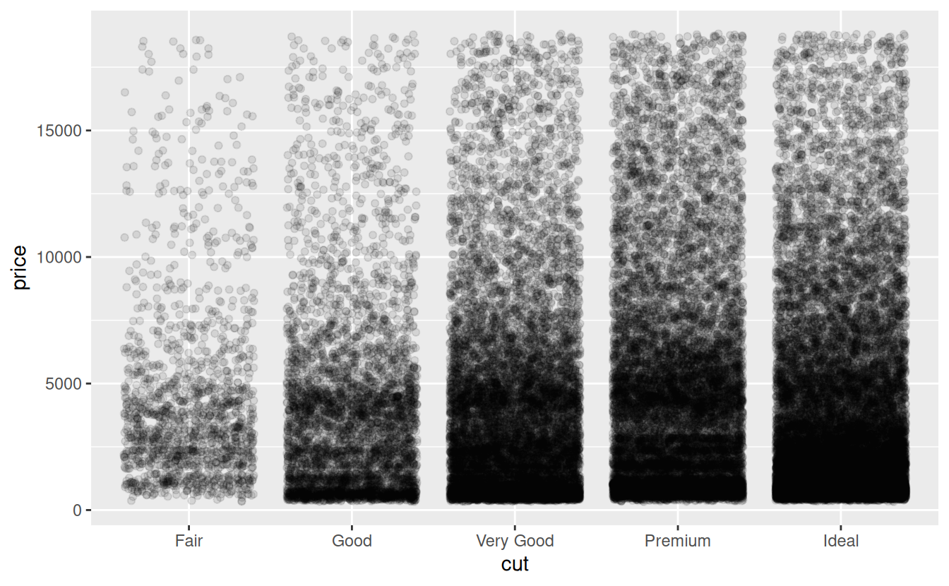
One nice thing about strip plots is that they make it easy to view the both the raw data and summary statistics such as the means and confidence intervals.
The trick to adding summary statistics to a ggplot based on raw data is that you have to first create a new data frame containing the summary statistics. If you remember, we summarized the price by cut like this:
Let’s expand that a bit to include upper and lower confidence limits:
price_summary <-
  summarize(
    diamonds_grouped,
    mean_price = mean(price),
    sem = sd(price) / sqrt(n()),
    ci_upper_limit = mean_price + 1.96 * sem,
    ci_lower_limit = mean_price - 1.96 * sem
  )
price_summary
#> # A tibble: 5 × 5
#> cut mean_price sem ci_upper_limit ci_lower_limit
#> <ord> <dbl> <dbl> <dbl> <dbl>
#> 1 Fair 4359. 88.7 4533. 4185.
#> 2 Good 3929. 52.6 4032. 3826.
#> 3 Very Good 3982. 35.8 4052. 3912.
#> 4 Premium 4584. 37.0 4657. 4512.
#> 5 Ideal 3458. 25.9 3508. 3407.Now that you have the summary statistics, add the means to the graph using the geom_crossbar() function. Because the crossbars will be based on the summary data, not the raw data, you will need to specify a new data argument and aesthetic mappings. The required aesthetics for geom_crossbar() are y, ymin, and ymax. Setting the color to red will make the crossbars stand out against the black raw data points.
ggplot(data = diamonds) +
  geom_jitter(mapping = aes(x = cut, y = price), alpha = .1) +
  geom_crossbar(
    data = price_summary,
    mapping = aes(x = cut, y = mean_price, ymax = ci_upper_limit,
                  ymin = ci_lower_limit),
    color = "red"
  )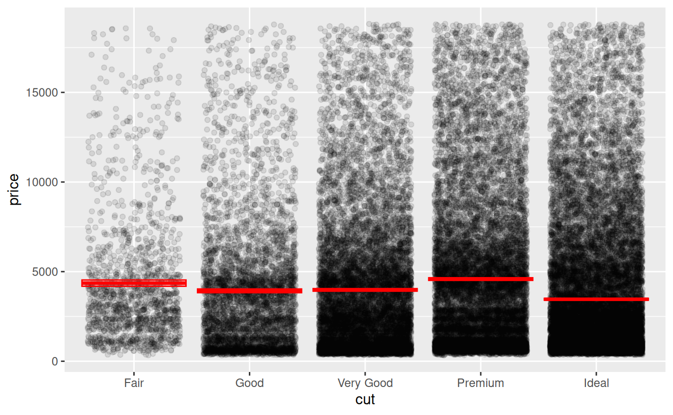
The boxes showing the 95% confidence intervals do not show up well because the sample sizes are so large. For a better idea of what they look like, and examples of other types of errors bars, see Vertical intervals: lines, crossbars & errorbars on the Reference page of the ggplot2 website.
6.9 Visualize two numerical variables
The most basic type of graph for visualizing the relationship between two numerical variables is the scatterplot. The geom_point() function can be used to add points two a graph. When it is used with numerical variables for the x and y aesthetics, the result is a scatterplot.
For example, the following graph shows the relationship between carat and price:
ggplot(data = diamonds) +
  geom_point(mapping = aes(x = carat, y = price))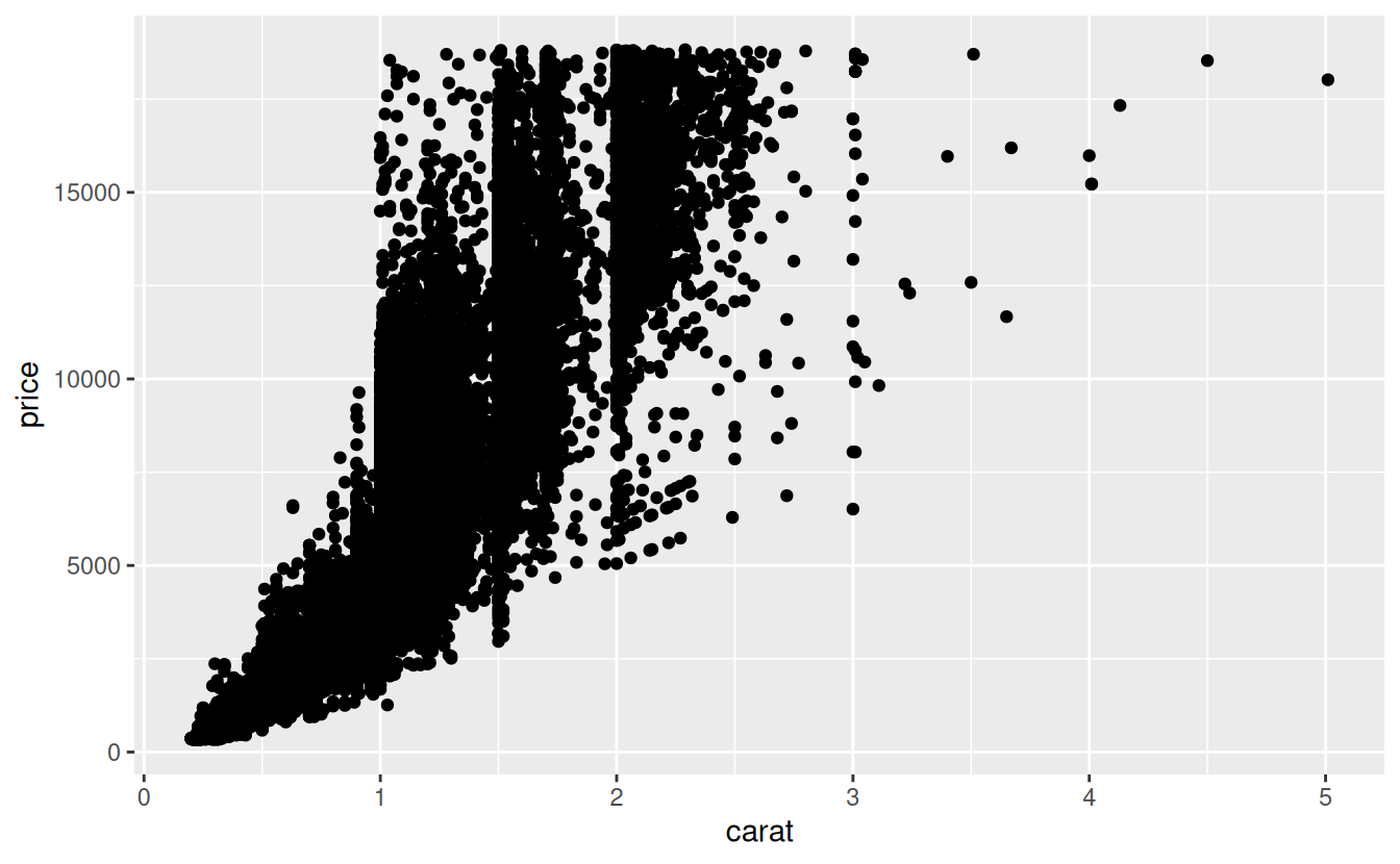
Looking at the graph it is clear that as the weight of the diamond increases, so does the price.
6.9.1 Plotting three variables
In order to more fully explore the relationships between multiple variables, it is sometimes useful the visualize them at the same time. For example, what if you wanted to see how cut, price, and carat are related?
One way to do this might be to use facet_wrap() to create a separate scatter plot for each cut.
A common alternative is to add a third aesthetic to the plot to differentiate points in some other way than by their x and y coordinates. These aesthetics include color, size, shape, and alpha for points, and linetype for lines. See the ggplot2 documentation on Aesthetic specifications for examples.
The following code plots the same scatter plot as above, but with the color aesthetic mapped to the cut variable. To reduce overplotting, the alpha level has been reduced to 0.3.
ggplot(data = diamonds) +
  geom_point(mapping = aes(x = carat, y = price, color = cut), alpha = 0.1)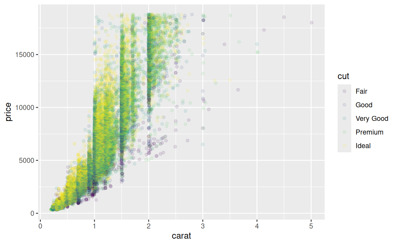
6.10 Assignment
First, create a new R script named assignment.R. At the top of the script, add code to load the tidyverse package.
For your assignment, you will work with the famous Edgar Anderson iris data set, which gives the measurements in centimeters of the variables sepal length and width and petal length and width, respectively, for 50 flowers from each of 3 species of iris. The species are Iris setosa, versicolor, and virginica.
You can print iris in the console to see the data set, but because it is a basic data frame and not an enhanced tibble, it will not print in the user-friendly manner of tibbles that you are used to. To have it print more nicely, turn it into a tibble first.
Add this to your script:
iris <- as_tibble(iris) # so it prints a little nicerNote that when you do this, iris will now show up in your Environment tab.
6.10.1 Questions
Now use what you know from previous labs, and what you have learned from today’s lab, to perform the following data manipulation tasks. For each question, put a comment like # question 1 on the line before, so you can read your script more easily, and follow each answer with a blank line to improve readability.
For each answer, you can simply print the resulting table. You do not need to assign it a name. Some questions have more than one part, e.g. you need to use multiple dplyr functions in a row. You may use intermediate objects for this, but you are encouraged to try combining multiple operations with the pipe.
Rename each variable so that it is all lower-case and uses an underscore
_instead of a period.in the name (the recommended coding style in the tidyverse style guide)Convert the four numerical variables from cm to mm by multiplying by 10
Calculate sepal area and petal area (area is equal to length multiplied by width). Print a table with only the variables sepal area, petal area, and species.
-
Calculate the following statistics for the entire dataset from the sepal length variable and print the resulting table:
- sample size
- maximum value
- minimum value
- range
- median
- first quartile (q1)
- third quartile (q2)
- inter-quartile range (iqr)
Your answer should be a tibble with exactly one row
-
Calculate the following statistics for each species from the petal width variable and print the resulting table:
- sample size
- mean
- standard deviation
- variance
- standard error of the mean
- approximate 95% confidence interval
Visualize the relationship between petal width and species using a strip plot.
Starting with the previous graph, add the mean and 95% confidence interval for each species
Visualize the relationship between petal length, petal width, and species using a scatter plot. Map the two numerical variables to the x and y axes and map species to the color and shape aesthetics.
6.11 Further reading
Your lab manual, R for Data Science (R4DS), contains detailed instructions on mutating, grouping, and summarizing in Chapter 5: Data transformation.
You do not need to read the chapter, but it would certainly help solidify the concepts introduced in this lab.
If you do want to read the chapter and try their examples in your own R Script then don’t forget to install the nycflights13 package as described in R4DS Section 1.4.4 Other Packages.